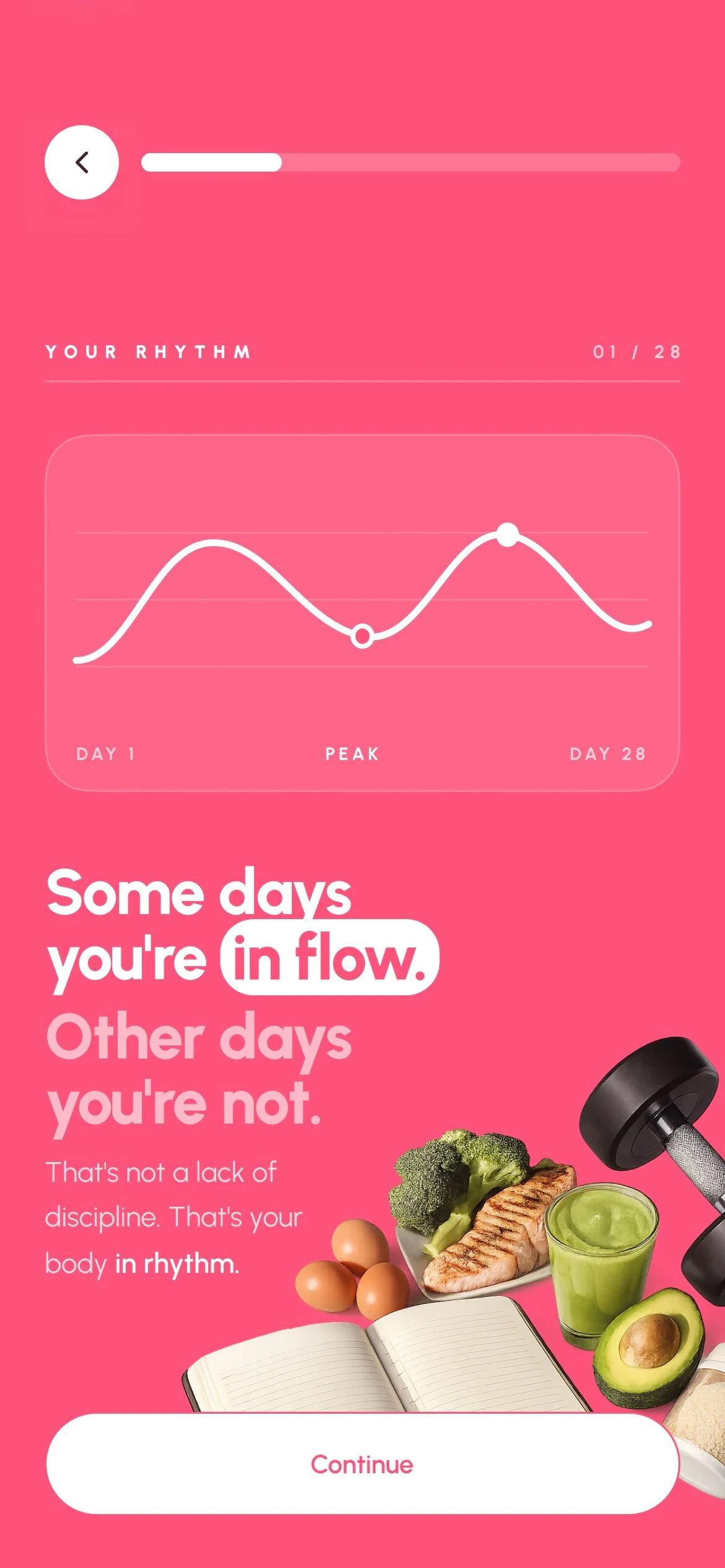
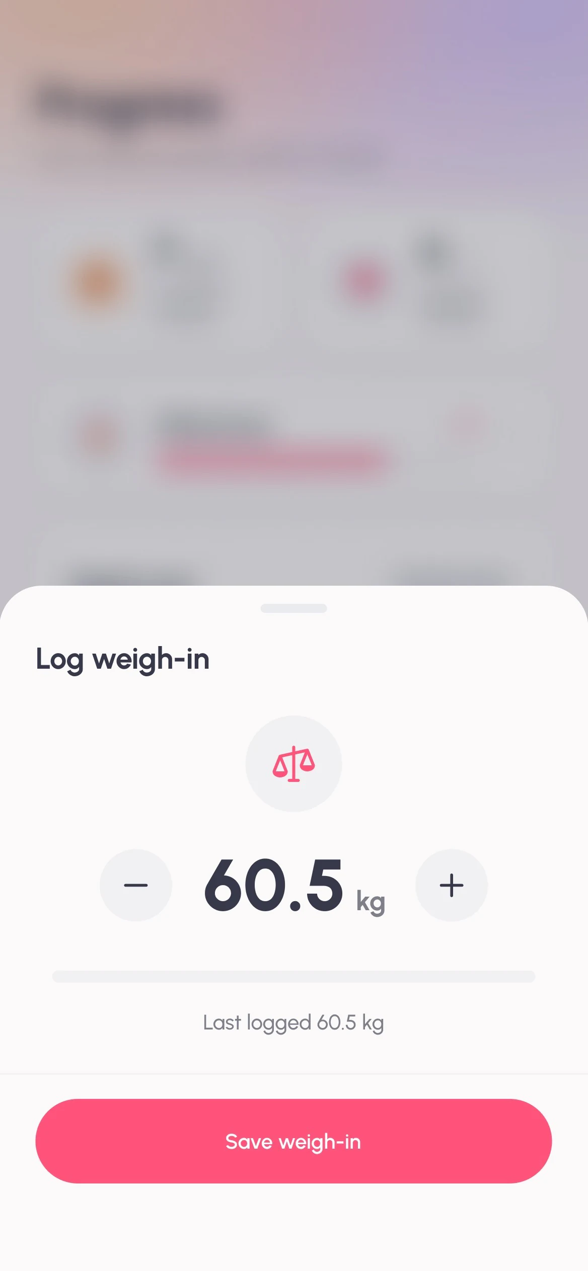
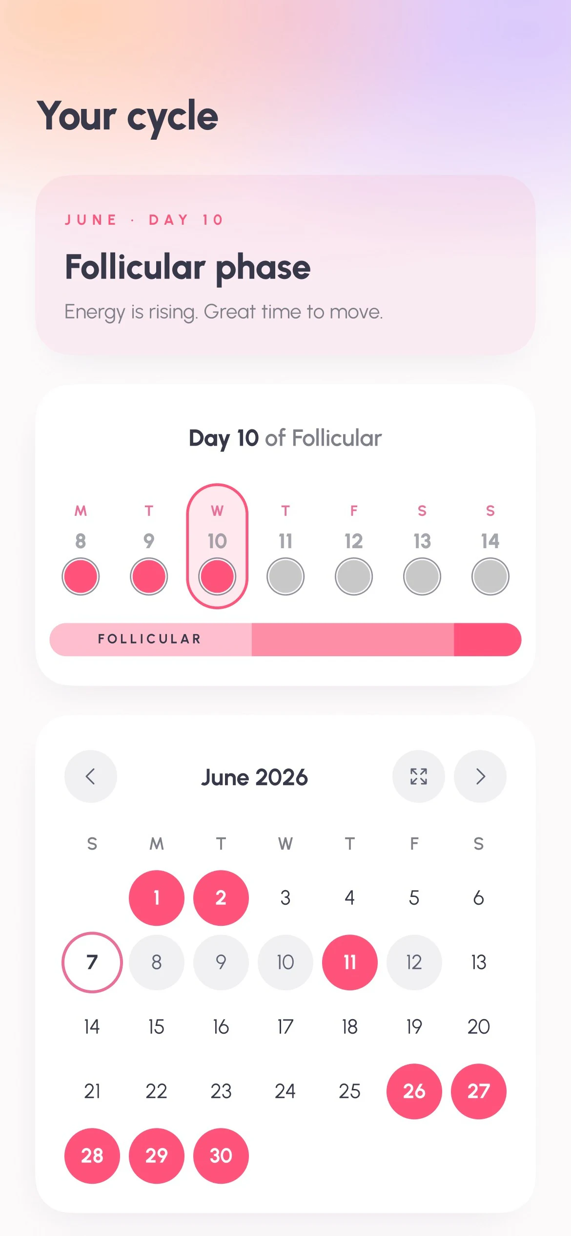
I designed a calorie tracker that finally understands a woman's cycle.
- Role
- Product designer
- Platform
- iOS
- What I did
- Every screen, flow and component, the design system behind them and the App Store screenshots.
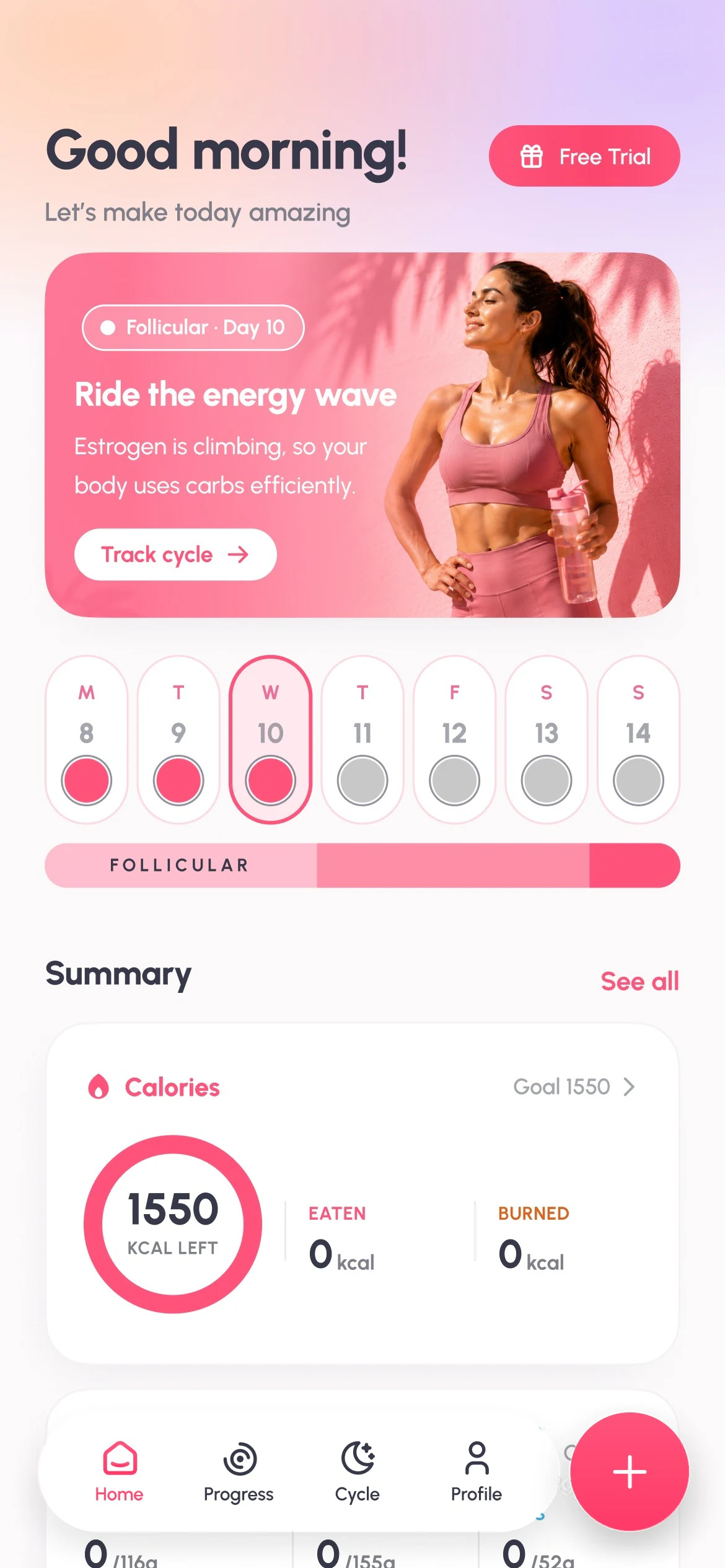

 Follicular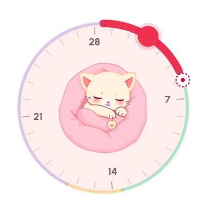
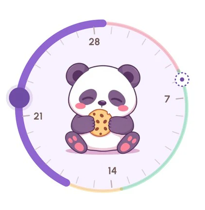 Follicular phase
 CaloriesGoal 1550
 50kcal left
1500kcal
0kcal
 MacrosGoal
113/116g
170/155g
43/52g
 Water
Water
1.8/ 2L
 Steps
Steps
0/ 8k

Salmon & veg12:00 PM
450 calories
P 28gC 51gF 13g
So I made one that changes with her.
The calls I made.
Each decision starts with the principle behind it. The orange tick is what I chose, and you can tap the other option to see what I left out.
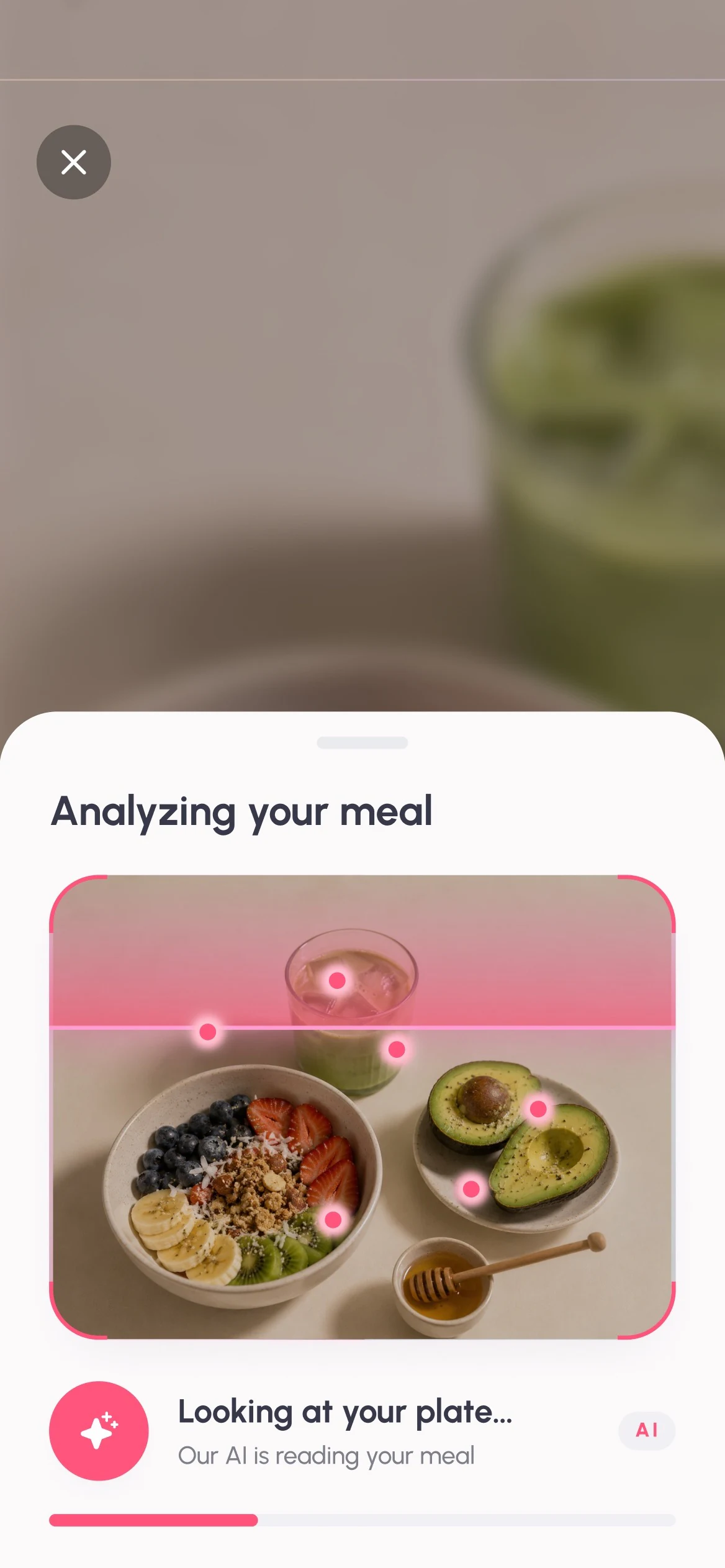
Logging in seconds.
Search a food database, or just take a photo?
Logging is where most people give up on calorie apps. A photo takes three seconds. The AI does the estimate, and you fix anything it got wrong.
Cycle-aware by default.
Cycle only in its own tab, or on the home screen too?
Your phase changes what your body needs today, which is why it sits at the top of the home screen with a short line explaining it.
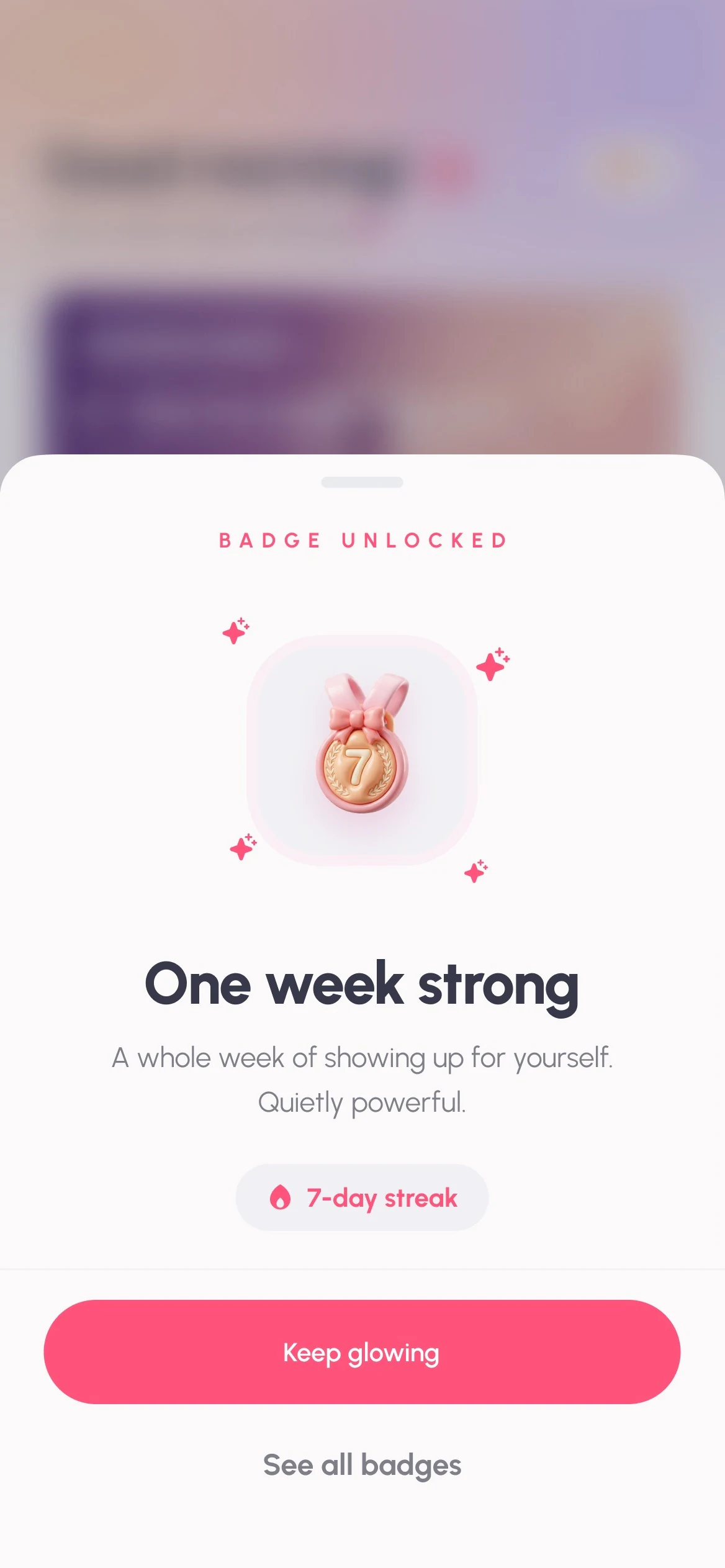
Kind about missed days.
Streaks that punish, or badges that celebrate?
Missing a day shouldn't feel like failing. There are no red numbers anywhere, and the badges celebrate the days you showed up.
The system I built.
Every screen is made from these. Try the colours and the switch.
The flows I drew.
9 flows, 92 screens. Here’s one from each.
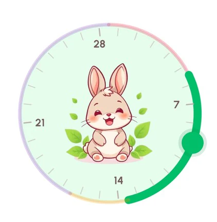
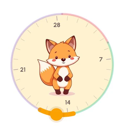
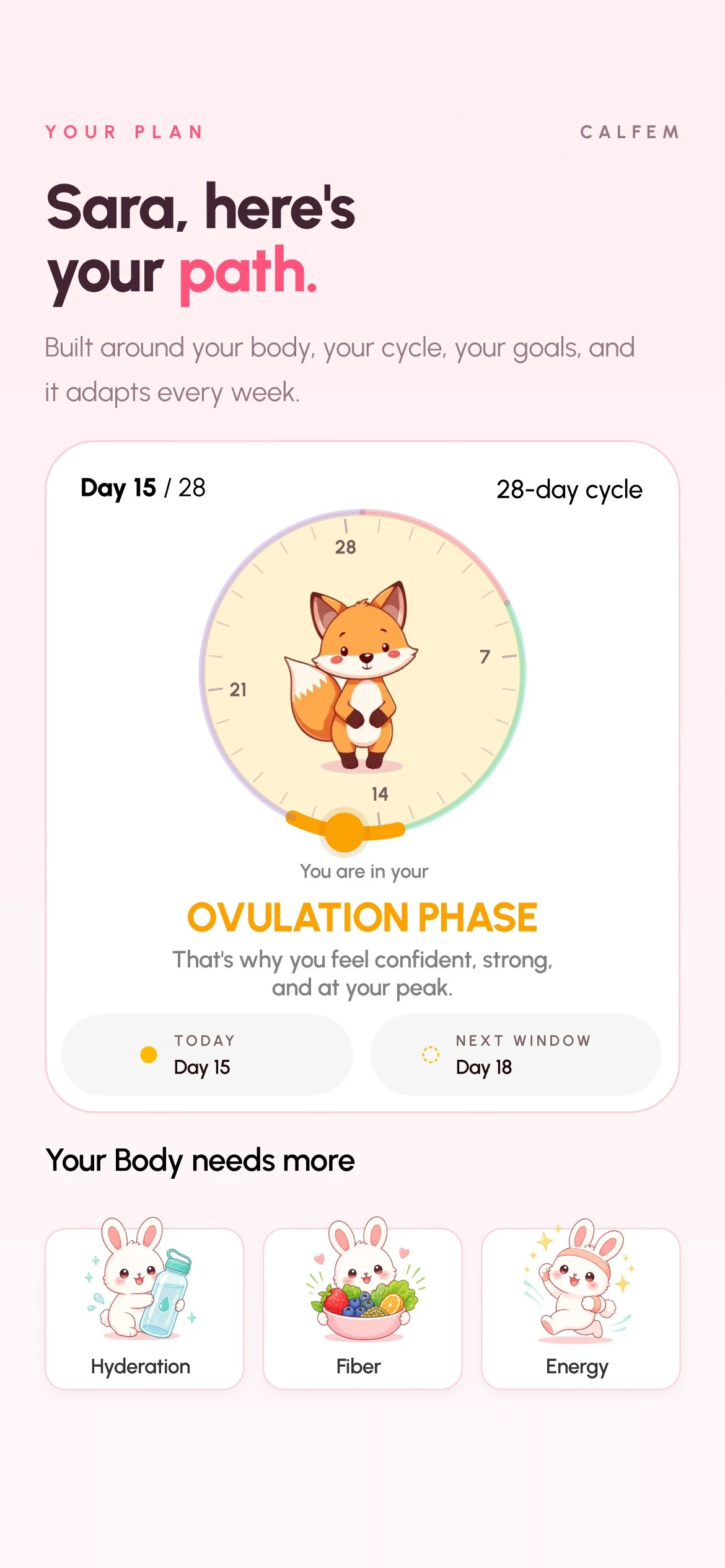
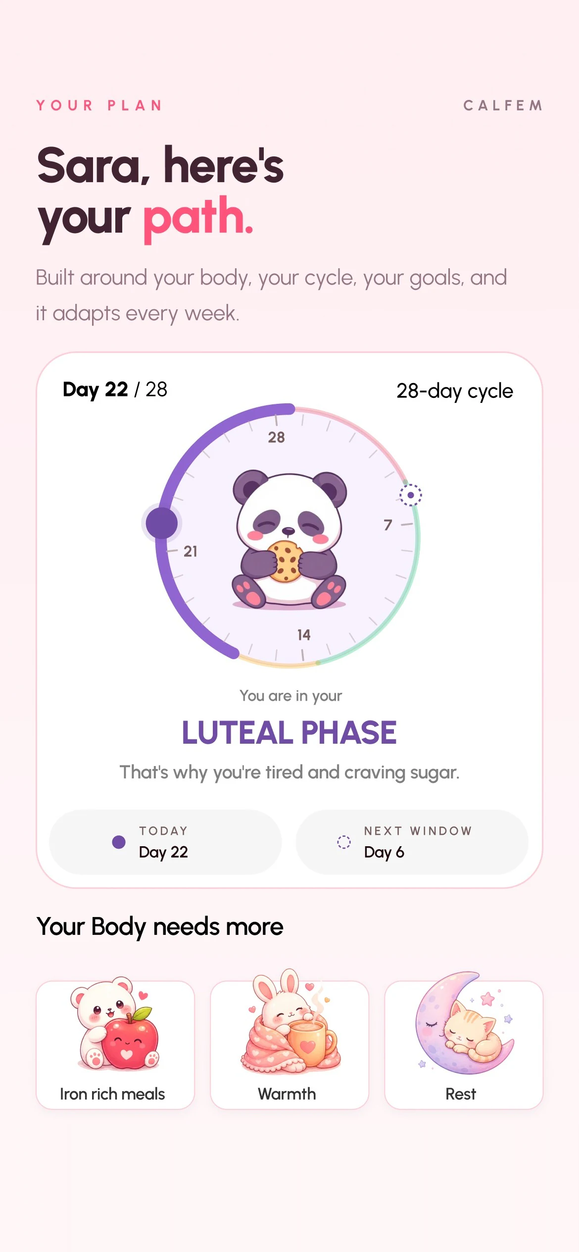
Her plan changes with her body.
Each phase of her cycle gets its own plan, from the dial to what her body needs more of. Drag through her month.
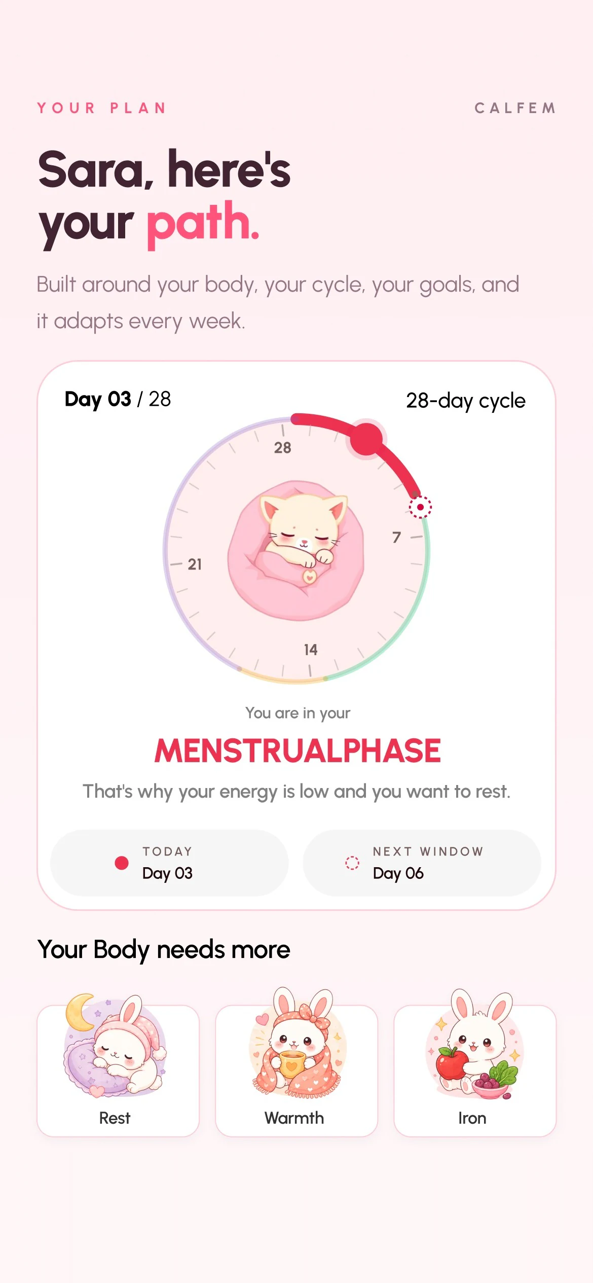

Day 9 · Follicular
One more thing…
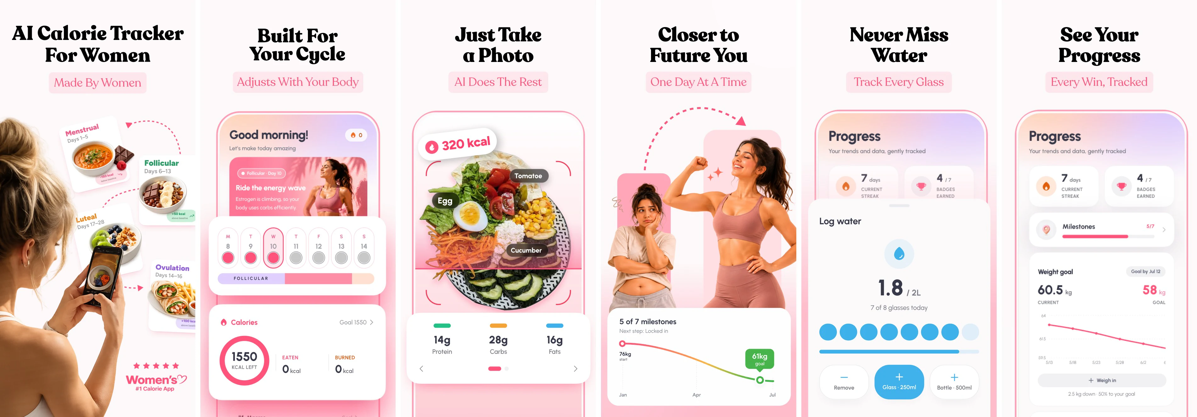
The App Store page was part of the work. Its six screenshots tell the whole story before anyone downloads the app.
With more time…
- 01Put it in front of real usersWatch five women log a week of meals, before adding a single feature.
- 02Bring it to Apple WatchA glass of water should be one tap from the wrist.